In today’s fast-paced digital world, the way users interact with the internet has undergone a remarkable evolution. With the surge in mobile device usage, web development services are increasingly adapting to a mobile-first design approach. This blog explores ten significant aspects of how these services are transforming to meet the needs of mobile users.
1. The Rise of Mobile Usage
Mobile devices have become ubiquitous, with recent statistics indicating that over half of global web traffic now comes from smartphones and tablets. This dramatic shift has forced web development services to prioritize mobile-first design, emphasizing the need for websites that are not only responsive but also optimized for smaller screens. Understanding user behavior on mobile devices has become paramount, influencing everything from layout decisions to the selection of content types that resonate with on-the-go audiences.
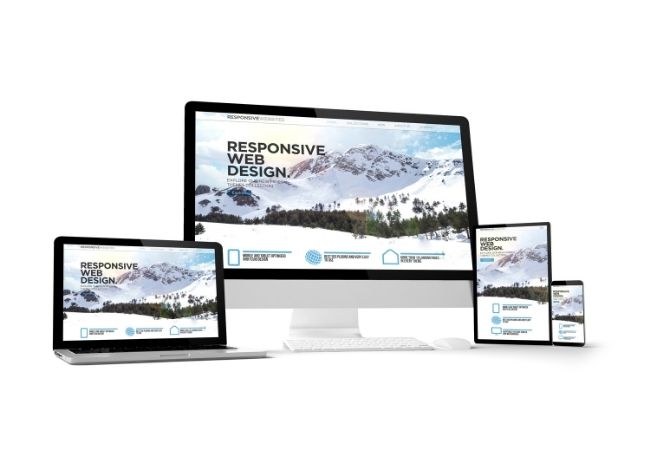
2. Responsive Design Principles
Responsive design has become the cornerstone of modern web development, allowing websites to adapt to various screen sizes seamlessly. Web development agencies are increasingly implementing fluid grids, flexible images, and media queries to ensure that websites perform optimally across all devices. This approach not only enhances user experience but also improves SEO rankings, as search engines favor mobile-responsive sites in their algorithms.
3. Prioritizing Speed and Performance
With mobile users often facing slower internet connections, optimizing website speed has become essential. Web development services are adopting best practices such as image optimization, lazy loading, and minification of CSS and JavaScript to enhance performance on mobile devices. These strategies ensure that mobile users have a smooth browsing experience, reducing bounce rates and increasing engagement on the site.
4. Simplified Navigation
Mobile-first design necessitates a reevaluation of website navigation to cater to the constraints of smaller screens. As a result, web development experts are simplifying menus, utilizing hamburger icons, and implementing touch-friendly elements. The goal is to create an intuitive, user-friendly navigation experience that allows users to find what they need quickly without the frustration of over-complicated interfaces.
5. Emphasis on Touch Interactions
Unlike desktop users, mobile users predominantly interact with their devices through touch gestures rather than a mouse. Web development services are adapting by designing interfaces that accommodate tap gestures, swipes, and pinches. This shift is crucial for enhancing usability, as well as providing a more engaging experience that leverages the capabilities of mobile devices.
6. Mobile-First Content Strategy
Content is king, but its presentation varies greatly between desktop and mobile platforms. As web development agencies adopt a mobile-first strategy, they are reevaluating the content delivery methods to ensure they are concise, engaging, and easily scannable. Mobile users often seek quick information, leading to the use of bullet points, short paragraphs, and clear headlines that facilitate faster understanding and retention.
7. Integration of Mobile-Optimized Features
Mobile-first design encourages the integration of features specifically aimed at enhancing mobile user experience. Web development services are now focusing on functionalities that cater to mobile users, such as click-to-call buttons, location-based services, and push notifications. These features not only improve user engagement but also foster brand loyalty by providing immediate solutions to users’ needs.
8. Leveraging Mobile Analytics
With the shift towards mobile-first design, the utilization of mobile analytics tools has become crucial for web development services. By analyzing user behavior on mobile platforms, developers and marketers can gain insights into user preferences and pain points. This data-driven approach allows for continuous optimization of mobile experiences, ensuring that websites evolve in alignment with user expectations.
9. Importance of Accessibility
As mobile users often come from diverse backgrounds and abilities, accessibility has become an important consideration in mobile-first web development. Web developers are utilizing various tools and standards, such as the Web Content Accessibility Guidelines (WCAG), to ensure websites are usable by individuals with disabilities. This commitment to accessibility not only complies with legal standards but also broadens the audience reach, creating a more inclusive digital environment.
10. Future Trends in Mobile-First Design
As technology continues to advance, the landscape of mobile-first web development is ever-evolving. Emerging trends such as Progressive Web Apps (PWAs), voice search optimization, and the integration of AI-driven personalization are shaping the future of mobile design. Web development services must remain agile and forward-thinking to stay ahead of the curve, ensuring they can deliver cutting-edge solutions that meet the dynamic needs of users in a mobile-centric world.
In conclusion, as mobile device usage continues to grow, web development services are necessarily shifting towards a mobile-first design approach. By focusing on responsive principles, performance optimization, and user-centered strategies, these services are ensuring that businesses remain competitive in an increasingly mobile-oriented market. Embracing these changes is essential for any organization looking to thrive in the digital age.